
Guest Post: Worst to First Jerseys, Ottawa Senators
Welcome all. Today we have a guest post from John van der Woude of <a href="http://hockeybydesign.com/">Hockey by Design</a>. John has a running series ranking jerseys of NHL teams from the very worst in their history to the very best, and today he's sharing his breakdown of the Ottawa Senators
<strong><em>This installment of the Worst to First Jerseys features the Ottawa Senators, and much thanks to Silver Seven for letting me guest post on their blog. On my own blog, I talk about about graphic design in hockey and </em><em>I'll be doing the jerseys for the rest of the league over time, so come by <a href="http://hockeybydesign.com" target="_blank">Hockey By Design</a> to check it out. </em></strong>
The Senators are the only team that has the honour of existing in two completely different eras of the NHL, with a 60-year gap in-between. Well, I guess the Winnipeg Jets are in that group too, but with only 15 years in-between their incarnations, and with some original Jets are still playing, it pales in comparison to Ottawa. Is there anyone who played for the original Senators even still alive? Not sure, and although the original Senators have absolutely nothing to do with the current Senators franchise aside from their name only, I decided to throw their jersey in the mix as well.
Here's how this works: I'll count down, from worst to first, all the jerseys the Senators have ever worn. Homes and aways will be lumped into the same category (so, more of a jersey "era") and I won't worry about small changes (like slightly changed positions of piping for example). Third jerseys will stand on their own. And I'm focusing on the jerseys only, not the entire uniform. The jersey images are compliments of the fine people over at <a href="http://nhluniforms.com" target="_blank">nhluniforms.com</a>. For the Sens, there's 7 different jerseys/eras. And we'll start with the worst one:
7. 2000-07 Third Jerseys
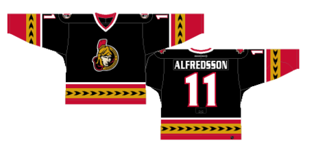
There's much to gripe about with these jerseys, so let's get right into it. First, the colours. I know the accent colour on these jerseys are supposed to be considered gold, but it's looks like what you put on a hot dog. That's not necessarily a bad thing if you're going to really own the colour like the Predators do, but if you're going for gold, pull from the Penguins and, like Danny Ocean, go for the Vegas gold. See? Better already. The gold the Sens use here just looks tacky and even though it's the same colour on their logo, this is - thankfully - the only jersey in their history that uses the colour in the design. I'm guessing it's on purpose.
Other than the golden mustard, many teams in the league had a fling with black jerseys during the late-'90s and early-'00s, including (but not limited to) the <a href="http://cdn.gunaxin.com/wp-content/uploads/2008/11/blackhawks_jersey.jpg" target="_blank">Blackhawks</a>, the <a href="http://s3.amazonaws.com/media.flyersfaithful.com/uploads/2011/06/mark_recchi_flyers.jpg" target="_blank">Flyers</a>, the <a href="http://www4.pictures.gi.zimbio.com/Toronto+Maple+Leafs+v+San+Jose+Sharks+3TVHXiN1TD_l.jpg" target="_blank">Sharks</a>, the <a href="http://2.cdn.nhle.com/coyotes/images/upload/2011/08/tkachuk2.jpg" target="_blank">Coyotes</a>, the <a href="http://2.bp.blogspot.com/_TwAbZhMGVEw/TBbezkiDJmI/AAAAAAAAKVw/7aWtzZtLQUM/s1600/davenadreychuk.jpg" target="_blank">Lightning</a> and, of course, the Sens with this jersey. Except for the Sharks, they've almost all disappeared and we can be thankful of that. Why? Because hockey is a game played on a sheet of white ice, with white boards, and one team wearing predominantly white uniforms. If the other team just wears black, it makes everything pretty monochromatic. Me, I like splashes of colour that the home team puts on. Watching <a href="http://blogimages.thescore.com/nhl/files/2012/01/wings-leafs-590x381.jpg" target="_blank">the Leafs against the Red Wings</a>, for example, looks more exciting than watching <a href="http://binaryapi.ap.org/f4a167d3091a491e95ebd02383e7f3e4/512x.jpg" target="_blank">the Kings play the Ducks</a>. When you have a nice clean slate of white ice to work with, add some colour to it.
Second, decorative piping just doesn't work. <a href="http://www4.pictures.zimbio.com/gi/Jordan+Staal+Carolina+Hurricanes+v+Montreal+F0jCnroMt3pl.jpg" target="_blank">Carolina does it too</a>, unfortunately. <a href="http://cdn.bleacherreport.net/images_root/slides/photos/002/048/863/Kings29_original_display_image.png" target="_blank">Los Angeles did it for a while</a> with text along the bottom of their jerseys. Also, the Atlanta Thrashers' jerseys had an <a href="http://www.hittheice.com/pics/EDHockey1/SCN_0084.jpg" target="_blank">almost identical pattern on their jerseys</a>, and when you're copying the Thrashers, you know you're doing something wrong. With the decorative elements there, it just becomes more of a distraction than an accent to the main focus on any hockey jersey: the logo in the middle. The best jerseys are the ones the compliment the main crest rather than compete with it.
I've never been that big on this logo of theirs either. But, I won't go into that here. I broke down their logo in a previous post that you can read about <a title="BTLNHL #21: Ottawa Senators" href="http://hockeybydesign.com/2011/11/btlnhl-21-ottawa-senators/" target="_blank">here</a>. Also, the font for the names are a big chunky and stoic. I'm not sure what font it is, but it's not a great font for a contemporary hockey jersey.
Jersey Recommendation: #6 Redden. J<strong>ust like these jerseys, t</strong>hey shouldn't have kept him as long as they did.
6. 2008-11 Third Jerseys
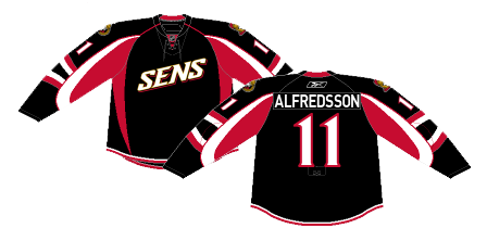
There's been many third jerseys in the NHL and, as many as there have been, very few of them could actually be considered a successful jersey design and even less have survived for very long. The Sens are obviously no different with two of their third jerseys taking the last two spots on this list. And like the previous one, there's a few different things wrong with this jersey too.
First, the crest. For some reason, in 2008, both the Lightning and the Senators decided to start using their nickname on their jerseys instead on the logos. Was this done in collaboration with each other, or did they just have the same terrible idea at the same time? Having text on the front of your jerseys is not a new concept - the Rangers have made their jersey iconic by doing just that - and <a href="http://assets.sbnation.com/assets/648545/jagr_mullet.jpg" target="_blank">Pittsburgh</a> and <a href="http://2.cdn.nhle.com/avalanche/v2/ext/miscImages/CA-thirdjersey_615x270.jpg" target="_blank">Colorado</a> (among others) have both played around with it over the years, but the Senators and the Lightning were the first to use their nicknames. "Sens" is slightly less ridiculous than Tampa's "<a href="http://cdn.bleacherreport.net/images_root/slides/photos/000/559/359/66736_thrashers_lightning_hockey_display_image.jpg?1292050456" target="_blank">Bolts</a>," but it's still a concept that doesn't make a lot of sense.
"Sens" is not exactly an iconic nickname for a team when the team's name is Senators, especially in hockey. You can basically predict any hockey player's nickname by shortening the last name and adding an "s" or a "y/ie". Alfie. Spezzy. The teams work the same way. Avs. Nucks. Philly. Pens. So, it's not exactly a creative thing to emblazon on the front of your jersey. About the only team in the league that could get away with it is the Habs, and they're not about to change their jersey anytime soon.
So now that I've beaten that one to death, what else is happening with this jersey? Well, there's still the issue of the black jersey that I talked about above, which I won't go into again.
Other than that, the piping on the jersey is pretty unconventional, and one of the handful of teams that tried to revolutionize hockey jersey aesthetics when the Reebok Edge jerseys were introduced in 2007. These pipings follow the new contours of the jersey rather than classical hockey conventions, which is not necessarily a bad thing, but the ones of this jersey go a bit overboard, with the giant fang-like red points in the front, to the super-thin red and white stripes along the base of the jersey, to the wavy lines on the sleeves below the numbers. The most maddening thing is its inconsistency, looking more like a garbled mess rather than having a coherent strategy...much like most of the projects on The Apprentice. And much like <a href="http://honolulunotes.files.wordpress.com/2011/04/trump-hair-style-sized.jpg" target="_blank">Donald Trump's hair too actually</a>.
Jersey Recommendation: #5 Lee. Pretty much the only name on the roster during these years that can't be shortened into a nickname.
5. 1997-99 Third Jerseys, 1999-2003 Away Jerseys, 2003-07 Home Jerseys
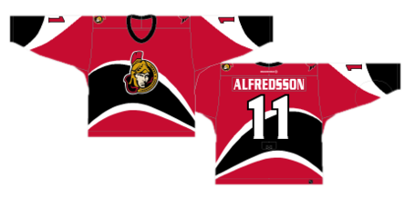
Another third jersey falling to the bottom of the list! But, one that's obviously a little better than the others and became their home jersey for 8 seasons. This makes me look like I'm not a fan of any third jerseys, but that's just not true. There's some beautiful alternate jerseys that have been worn over the years. The <a href="http://cdn.nhl.com/ducks/images/upload/2010/11/DR132801_slide.jpg" target="_blank">Ducks</a>, <a href="http://cdn.nhl.com/blues/images/upload/2008/09/thirdjersey_boyes.jpg" target="_blank">Blues</a> and <a href="http://cardiaccane.com/files/2009/12/Wild-3rd.jpg" target="_blank">Wild</a> all have beautiful ones, but too often a third jersey seems to be a license for the team to go apeshit with their designs. This one isn't nearly as bad as <a href="http://www.icethetics.info/storage/jerseys/184/nhl/ana96d-selanne.jpg" target="_blank">some others</a>, but again, it's unconventional in some not-so-great ways.
Of course, the main feature on this jersey is the very organic black and white stripes running around it. I like that it actually embraces the idea of movement and speed, which are two aspects that epitomize the game of hockey. This also has a much more consistent pattern than the previous jersey I talked about, but I've never been a fan of anything taking away from what should be the main focus of any jersey: the team logo.
The NHL is somewhat unique among the four prominent sports leagues in North America (NBA, MLB and NFL) in that it's the only one that prominently displays the team logo on their jerseys. The NFL puts them on their helmets, the NBA usually makes them small and puts them on their shorts, and MLB puts the full team logo nowhere on their uniforms. It's one of the things I love about hockey aesthetics that they do this, giving the logo a prominence that almost no other sport gives. The stripes on this jersey diminishes the overall impact of the logo by becoming the main feature itself.
That being said, I like the movement it gives the jersey and, for all of its waviness, it's actually quite a simple design, without anything else to complicate it. It's not a bad jersey, but it's not up there with the best the Senators have worn.
Jersey Recommendation: #18 Hossa. Probably the player with the most pure skill on the team during this time, and as him jumping from Atlanta to Pittsburgh to Detroit to Chicago has shown, he likes a lot of movement as well.
4. 1992-99 Home and Away Jerseys, 1999-2003 Home Jerseys, 2003-2007 Away Jerseys

The modern era originals - and the first on this list that was never a third jersey - comes in at number four on the list with, after the previous batch of jerseys we've talked about, what I would consider to be a more classic hockey jersey. It's got the two solid thick lines along the bottom of the jersey and three solid thick lines along the sleeves, and then the logo right in the middle. Simple, iconic, classic.
And maybe that's the problem. It's pretty nondescript and unmemorable. There's nothing necessarily that bad about it, but there's nothing that great either. Well, okay, there's a couple things bad about it...
One thing that is necessary in design, especially when dealing with a jersey or a uniform, is - not ironically - uniformity. I talked about it briefly for the #6 jersey on this list, and it's happening here again where the piping on the sleeves is not the same as what's at the base of the jersey. The two solid stripes don't match up with the three stripes on the sleeves, either in pattern or the width of the stripes. It's a bit awkward. You know what's really awkward? <a href="http://farm4.static.flickr.com/3349/3586978070_60fcbed022_o.png" target="_blank">When you realize your fly's open</a>.
Also awkward? Putting the numbers on the sleeves right overtop of the stripes. It's cluttered and unnecessary. Move the stripes down a bit and the numbers up and there's no problem anymore.
And by now you know how I feel about black jerseys. The white jersey, strangely and thankfully, lasted much longer than the black ones, which were replaced by the ones rated at #5 on this list, featuring a new alternate logo for several years, which eventually became the main logo. JUST PICK A LOGO GUYS!
Again, it's not a bad jersey at all, and obviously better than the other jerseys I've already talked about. But, there's nothing that really stands out about it either as being great. So, it's pretty much in the perfect spot of being right in the middle of the pack, here at #4.
Jersey Recommendation: #7 Cunneyworth. The first few years were tough years for the Senators, but Cunneyworth had a decent few seasons with the Sens and was their first multi-year captain. I have a feeling some of the other players from the era (Bonk, Daigle, Yashin, etc) wouldn't be as well-received.
3. 1917-1931 Jerseys
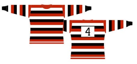
The jerseys (or sweaters, as they were more commonly referred to back then) from the original incarnation of the Ottawa Senators look strange and intense for modern hockey aesthetics, but given the context of the time, these are pretty sweet looking jerseys.
The stripes, yes, are pretty intense, but it's <a href="http://nhluniforms.com/1927-28/1927-28.html" target="_blank">not unusual for the era</a>. Back then, the jerseys were <a href="http://nhluniforms.com/DefunctTeams/Images/Americans03.png" target="_blank">loud</a> and <a href="http://nhluniforms.com/DefunctTeams/Images/Tigers3.png" target="_blank">full of stripes</a>, so these Sens jerseys fit in very well. And for the time, they're one of the best jerseys that were worn. Comparing them, though, to the modern era is a bit more tricky. They <a href="http://i.telegraph.co.uk/multimedia/archive/02079/penguins_2079836i.jpg" target="_blank">stick out like a sore thumb</a> and don't even show a logo anywhere. It's just a bunch of stripes with a number.
<em>Note: Other versions of the same jersey had various crests on them though, including a <a href="http://nhluniforms.com/DefunctTeams/Images/Senators7.png" target="_blank">large "O" from 1929-34</a>. Other patches were all alarmingly boastful crests calling themselves <a href="http://hockeybydesign.com/wp-content/uploads/2013/03/Senators_23-24_Championship_Patch.jpg" target="_blank">"World Champions"</a>, celebrating their Cup championships in 1921, 1922 and 1927, essentially reminding all the other teams they played that season how much they sucked. Could you image if the Kings had worn a similar patch this year? Jeepers, they'd have to bring Marty McSorley back to defend themselves.</em>
But the thing I like about these jerseys that the current Sens had a hard time figuring out is the uniformity of the stripes. In terms of colours, too, they chose the strongest colour combination you could have: red, black and white. It's implies dominance and aggressiveness; and when matched with the strong simple lines of the stripes, it's an imposing jersey. Personally, I think it's an awesome design, but doesn't get higher on this list because it's out-of-place with modern hockey aesthetics. But if Ottawa ever gets to play in a Winter Classic, they should be wearing these jerseys.
Jersey Recommendation: #8. The number worn by Frank Finnigan, the Senators' captain from 1930-33, is the only number officially retired by the team. Another option is #5, for Cy Denneny, who was one of the most dominant wingers in the league during the time, scoring 36 goals in 20 games during the 1917-18 season.
2. 2007-present Home and Away Jerseys
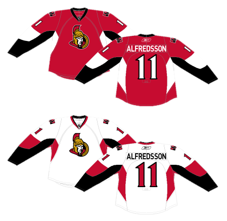
The current jerseys are the biggest step the current iteration of the Senators have taken in getting their jersey designs right. It's by no means a traditional hockey jersey, and the design elements are more based on the contours of the new Reebok Edge jerseys, but compared to the "Sens" third jersey I talked about above, these find a nice balance between being distinctive but refined and, <a href="http://thyme2.typepad.com/thyme_for_cooking_/images/2007/08/06/burntsausages.jpg" target="_blank">unlike a bad BBQer with hot dogs</a>, not overdone.
The simplicity is from the elimination of any extra design elements. There are no stripes along the base of the jersey. There's no extra non-uniform stripes on the sleeves. There's no big swash of colour going across the front of the jersey. The black and white/red stripes that are there work well because they're kept on the sides and the sleeves, they're all uniform in both their general shape and thickness. The pointed fangs that were on the "Sens" jerseys are moved to the less-important back of the jersey and are not nearly as dramatic and over-bearing. Plus, it actually frames the numbers on the back quite nicely.
Basically, they're trying something new for a hockey jersey design, but it's toned down from previous jerseys, creating something that's distinctive but still allows the jersey to be a little more traditional by allowing the logo on the chest to still be the prominent feature. The extra elements compliment the logo without taking over.
Also, the font for the numbers work well with the black and red/white stripes. They're strong and pointed, while still having some movement. Just like in <a href="http://gamemedia.wcgame.ru/data/2011-07-09/original-memory-game.jpg" target="_blank">Memory</a>, it's a good match.
And, their dark jerseys aren't black! Red is much better as it adds some colour to the blank white of the sheet of ice they play on. That alone pushes these jerseys near the top.
Jersey Recommendation: #19 Spezza. A talented player that sometimes doesn't get the recognition he deserves around the league, much like this jersey. It's a nice one, so wear it with pride.
1. 2011-present Third Jerseys
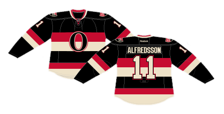
See? I don't hate all third jerseys. It's just so easy to go overboard with them that most of them deserved, <a href="http://www.youtube.com/watch?v=VlaiBeLrntQ#t=0m28s" target="_blank">like the Balrog of Morgoth</a>, to go back to the shadow.
But this jersey, this is a perfect balance of historical and contemporary aesthetics to create a third jersey that actually makes sense for a team, instead of just an exercise in increasing jersey sales.
There's tons of things to like about this jersey, including bringing back the large "O" on the chest. In the entire history of the NHL, only one other team city has started with an O - the Oakland Seals from 1967-1970. And the only other team that could lay claim to an O in any capacity is the Oilers, and their logo/jersey is <a title="Worst to First Jerseys: The Edmonton Oilers" href="http://hockeybydesign.com/2012/11/worst-to-first-jerseys-the-edmonton-oilers/" target="_blank">too iconic to mess with</a>. The O belongs to Ottawa and they can own it as much as they want. It's a simple, logical and iconic brand extension for the franchise.
It also connects to the Senators' historical jersey with the use of stripes going across the chest. Yes, I commented earlier about how this is a problem on previous jerseys, but the stripes are solid and straight, and with something as simple and iconic as an "O", it works. And hell, <a href="http://2.bp.blogspot.com/_9iiXiFMG8BE/Sddp7AN8xkI/AAAAAAAABFY/2BRc4LrC8OU/s400/habs_81906.jpg" target="_blank">Montreal has been getting away with it for years</a>.
The stripes are not as loud and obnoxious as the historical jersey because of the reduced repitition of it. Plus, the two thick stripes were used previously along the bottom of their original modern era jerseys, so it has a foot in modern hockey aesthetics as well. It's repeated at the base of the jersey with the exact same thickness as what's on the sleeves (or as best as can be because of the rounded bottoms of the jersey). The stripes on the chest are thicker than the others, but it's still two equi-thick lines, so it works. That being said, I think the stripes on the bottom are a bit unnecessary, but it doesn't bother me enough to downgrade the jersey.
Yes, these jerseys can be considered black, but with the dominance of the stripes, there's enough colour and pattern being prominent in the jersey that it doesn't take over the entire jersey. On a clean sheet of white ice, it's still a decent splash of colour. And in this case, white is a colour since it's more of a cream, or if it were a paint chip, I'd call it Heritage White. Again, it adds a touch of the historical to the jersey which I love.
All in all, this is an awesome jersey and the epitome of what a third jersey can do to build a visual brand for any team. Go buy one now!
Jersey Recommendation: #11 Alfredsson. Although the team may have had other players with more pure skill than him, Alfie is the heart of the Sens and their franchise player. He deserves to be on the best jersey the Senators have ever worn.