
A New Tool to Visualize Shot Locations
One of the really cool things about the internet is the connectivity it allows. Although there's a lot to be wary of, which is why many high school students are learning how to navigate the internet using critical thinking skills, it allows independent creators to easily get their ideas across to a wide audience. It occasionally spawns new, interesting ideas, or modifications on older work, which is a tried and true principle that is at the heart of science. I really think that Twitter is a fantastic tool, if used correctly, as it allows you to create a feed of information that's primarily about things that you are interested in (or people you're interested in). Today, this tool was brought to my attention. Created by Andrew Thomas, a statistics professor based in Pittsburgh, this tool helps us visualize shot locations in a unique way. Thomas wrote about it himself here, which I suggest you check out before reading this article.
We've had access to NHL shot location data for a while now (07-08), and Greg Sinclair's tool has been great at plotting the x,y coordinates of shots for and against. Thomas' tool builds on this, and allows us to generate the cool graphics below. Of note, only shots on goal and missed shots are counted, as the NHL does NOT track coordinates for blocked shot totals - in other words, these graphs show Fenwick. This is good, as tracking shot attempts allow for a greater sample size than just shots itself, and both Corsi + Fenwick correlate well with scoring chances and goals in the long term.
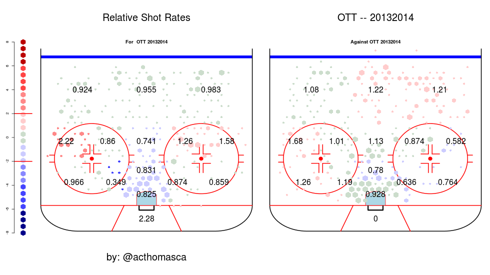
To start us off, here's a graphic showing Ottawa's relative shot rates at even-strength. Red means that that the numbers are high relative to the league average, whereas blue means the numbers are low relative to the league average. The darker the colour, the higher/lower this is. So for the left graphic, Ottawa attempts 2.06 more shots in the left/middle side than the league average, whereas on the right graphic, Ottawa allows 1.25 more shots than the league average in the same location.
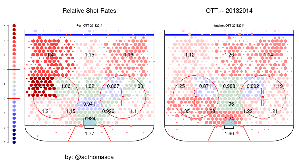
(click for larger image)
The left graphic is oriented from the opponents viewpoint - so RD and RWers are on the left-side and vice versa. In contrast, the right graphic is back to normal orientation - so the RD is on the right side.
First thought: holy crap, the Erik Karlsson effect. This certainly meets the eyeball test for me, as I've always thought that MacLean isn't scared to let his defensemen activate in the offensive zone, and it looks like they're doing their job. A bit more worrying are the shot totals around the home plate area, where Ottawa is around average (green), and are relatively poor in the area right around the net (blue). Thomas has made past data available as well, and when I go back to 2011-12 and 2012-13, I see the same trend - lots of shots by the defense, and average shots in the dangerous, scoring chances area.
Defensively, the Sens are in a bit of a jam. They give up a lot of shots directly in front of Anderson + Lehner (+1.24) and also from the right point. They actually do a very good job at blocking off the top of the circles and the slot, and this may be a systematic thing - the forwards collapsing in the slot or getting their sticks in the lane. Another interesting observation to note is the space the opposing forwards seem to have on the bottom-left side, perhaps implicating the left defense (Cowen, Phillips, Methot) as needing improvement, seeing as the Sens are giving up less shots in the same area on the right side. A quick comparison to 2012-13 shows a marked decrease in the amount of shots given up right in front of the goaltender, and similar totals in the slot + other scoring chance areas.
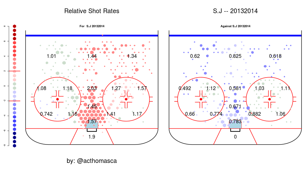
For a quick comparison, here are the relative shot charts for San Jose, the 3rd best regular season possession team. I picked San Jose mainly because I use their charts below when I get to the PP, so I wanted to keep it consistent (and also because they're a damn good team).
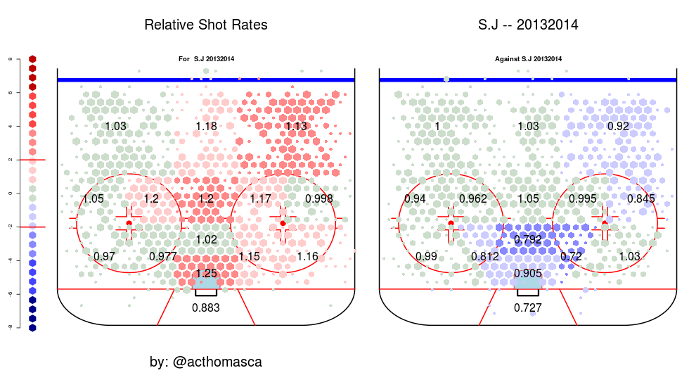
Gee, it's almost like preventing shots really close to your goaltender is going to help defensively! Using Fenwick in order to keep consistent with the graphics, Ottawa gives up way more Fenwick/60 compared to San Jose (45.2 vs. 38.8), so obviously improvement needs to be made in the overall totals for the Senators. However, I'm sure that giving up shots from these dangerous locations help contribute to the difference in goals against/60 totals at EV (2.67 vs. 2.11), especially considering that there's only a slight difference in EV goaltender save % between the two teams (0.924 vs. 0.921).
On that note, we can also generate the same graphics for relative shooting percentages.
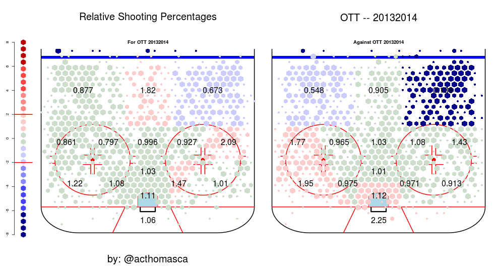
This seems to match up pretty well. Ottawa was 23rd in the league with a 7.3% EV shooting %, so you'd expect them to be around average - which they are. Their totals appear to be brought down by a hideous total from the left point.
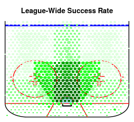
Defensively, it looks like all of those shot attempts from the right side don't matter much, with barely any going in. Alternatively of course, the sh% total could just be brought down by the number of shots Ottawa gives up from the right point compared to the left, but both are below average. This is what we'd expect to see, as looking at Thomas' generated league-wide success (goal) rate below, the closer the shots are to the net - in the scoring chance area - the more likely they will turn into goals. This is intuitive, but it's nice to have it visualized in the data.
Kind of related to those #LRT, I've found so far that ev save % on shots from the scoring chance area is .864. Outside SC area: .966
— Robert P. (@RobertJFTC) April 30, 2014 Lastly, we can glance at Ottawa's relative shot rates on the powerplay.
Again, we see the same trend as EV. Ottawa seems to generate an average, or above-average amount of shots from the points or the top of the faceoff circles, but nearly not enough from the front of the net, which is where you're more likely to generate scoring chances, and score on your shots. For comparison, here's the "gold-standard" of powerplays - San Jose. As we can see, there's a TON of shots right down the slot, and they prevent shots in the same location. Although Ottawa's PP actually ran at a higher clip than San Jose's (18.4% vs. 17.2%), San Jose generated way more shot attempts, which is a better predictor for future success.
All in all, this is a pretty neat tool to look at. It's hard to infer much causal information from it, mainly because the NHL's tracking system for shot coordinates is wonky and nowhere near what the NBA has with SportVU. Being able to filter this data into home-and-away situations, or to vary by date and compare monthly totals would be great, and hopefully the tool continues to be developed further to allow for that. Analytics is best used as a method, and it's great to confirm in the data what we see with our eyes. I'm a firm believer in "knowledge is power", and it's best to use all of the resources that you have available when making a decision. Who knows, perhaps Bryan Murray is looking at the low shot totals in front of the net in order to justify his need for a "hard forward".
Thanks for reading!